Smoothing and measurement choices.
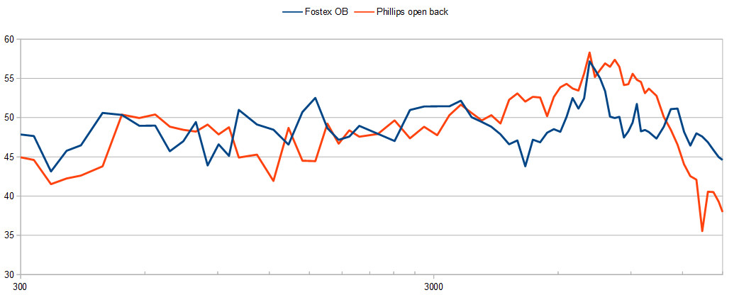
This on-axis plot makes the Phillips TV speaker look like it has substantially more hot / uneven treble than the Fostex. Plot shows 300Hz - 15 kHz.
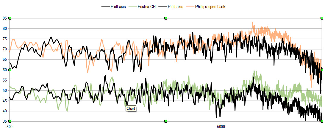
This more detailed plot shows the off axis response in black, on-axis in colour. The TV speaker has flatter and more extended treble, which perhaps goes some way to explaining why it sounds nicer.
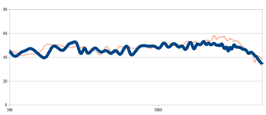
This is how I'd display the TV speaker's output if I worked in advertising, and wanted to shill it as the world's best wide band speaker:
- show an unnecessary amount of the vertical axis
- use 20 dB divisions
- use smoothing
- make the best looking plot most prominent